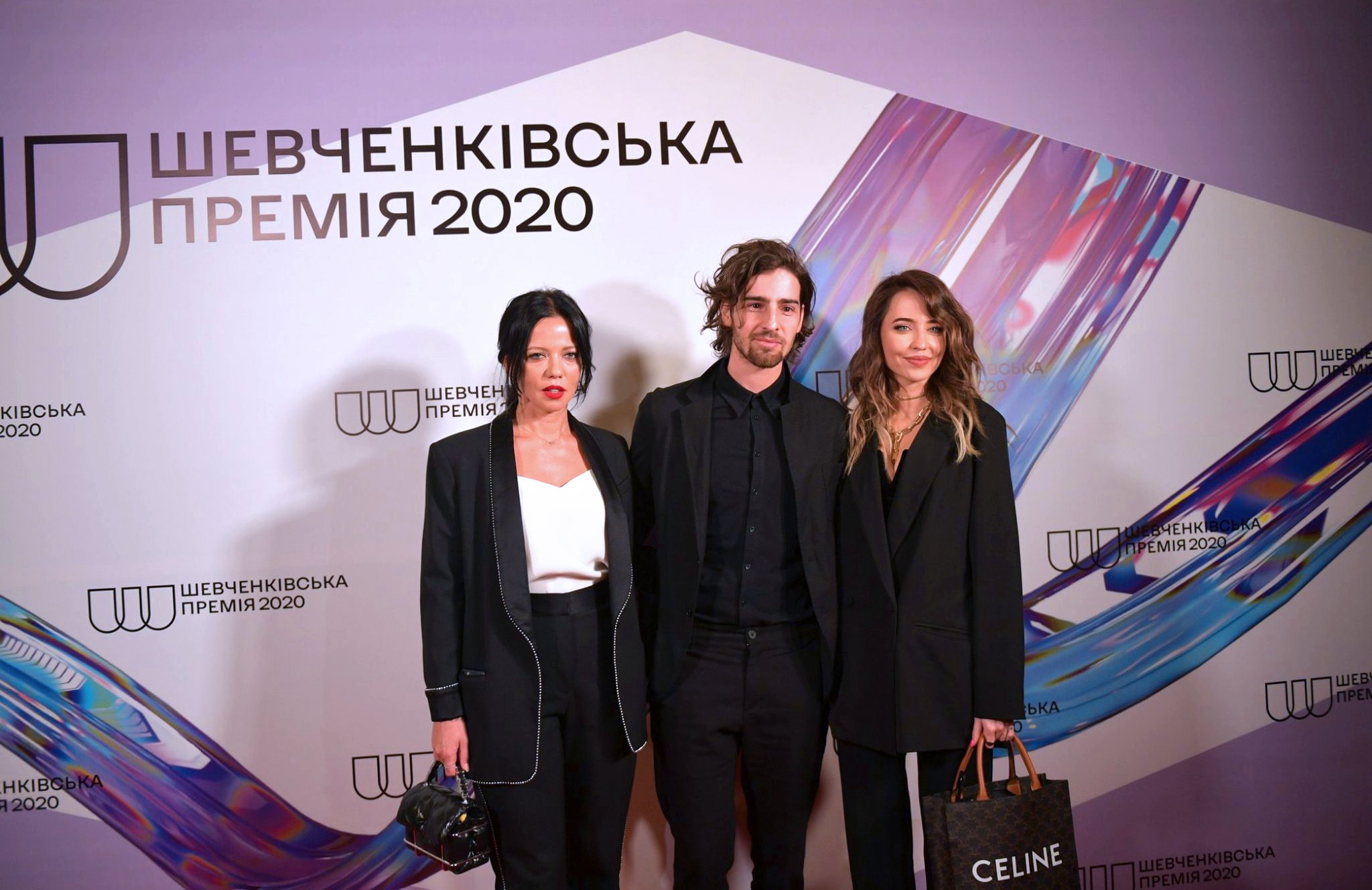
Shevchenko National Prize •
Shevchenko National Prize •
R O L E :
Logo Design • Brand Identity Design • Motion Design


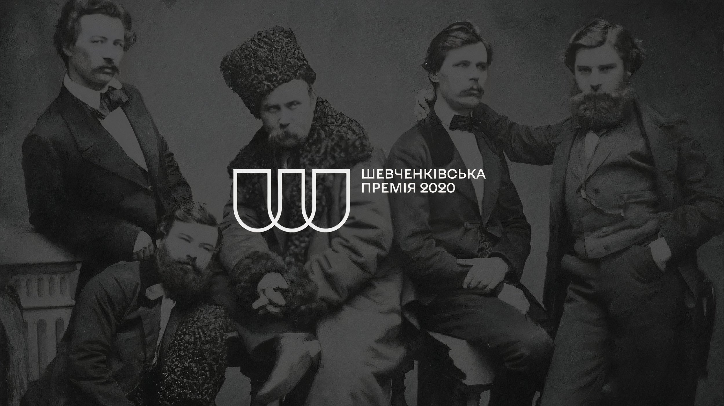
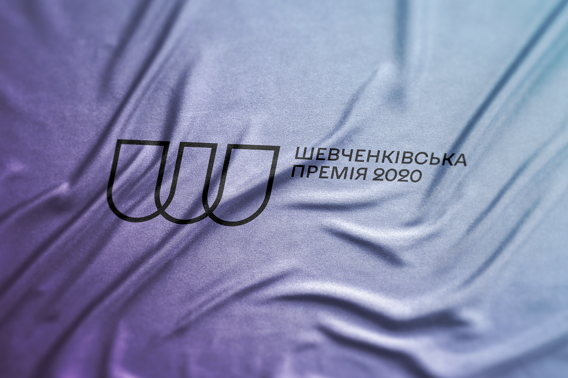
Shevchenko National Prize is the highest state prize of Ukraine for works of culture and arts awarded since 1961.
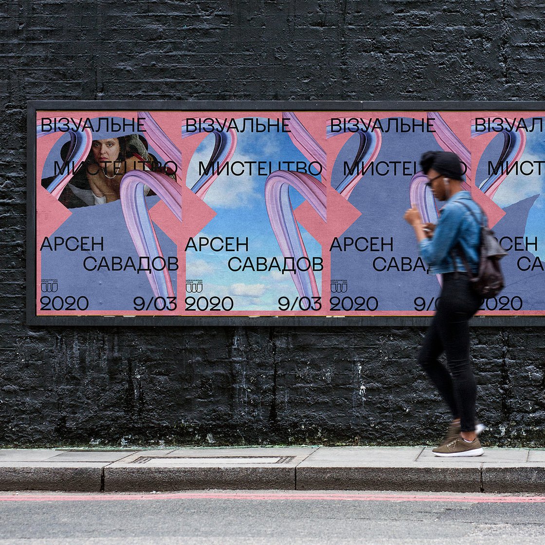
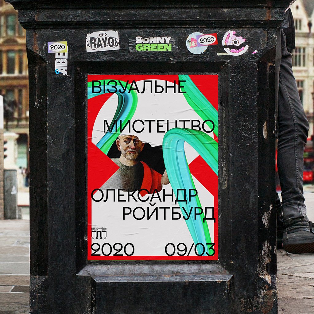
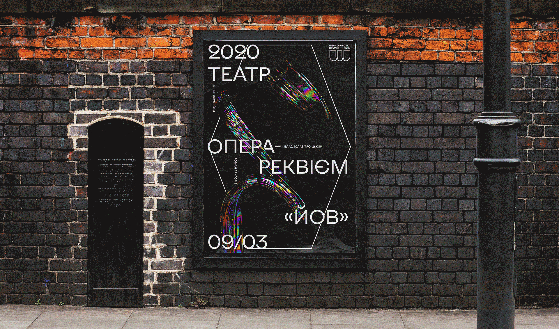
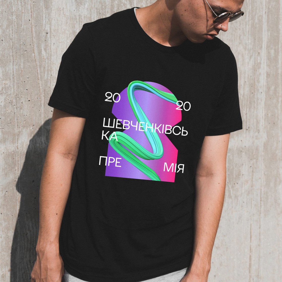
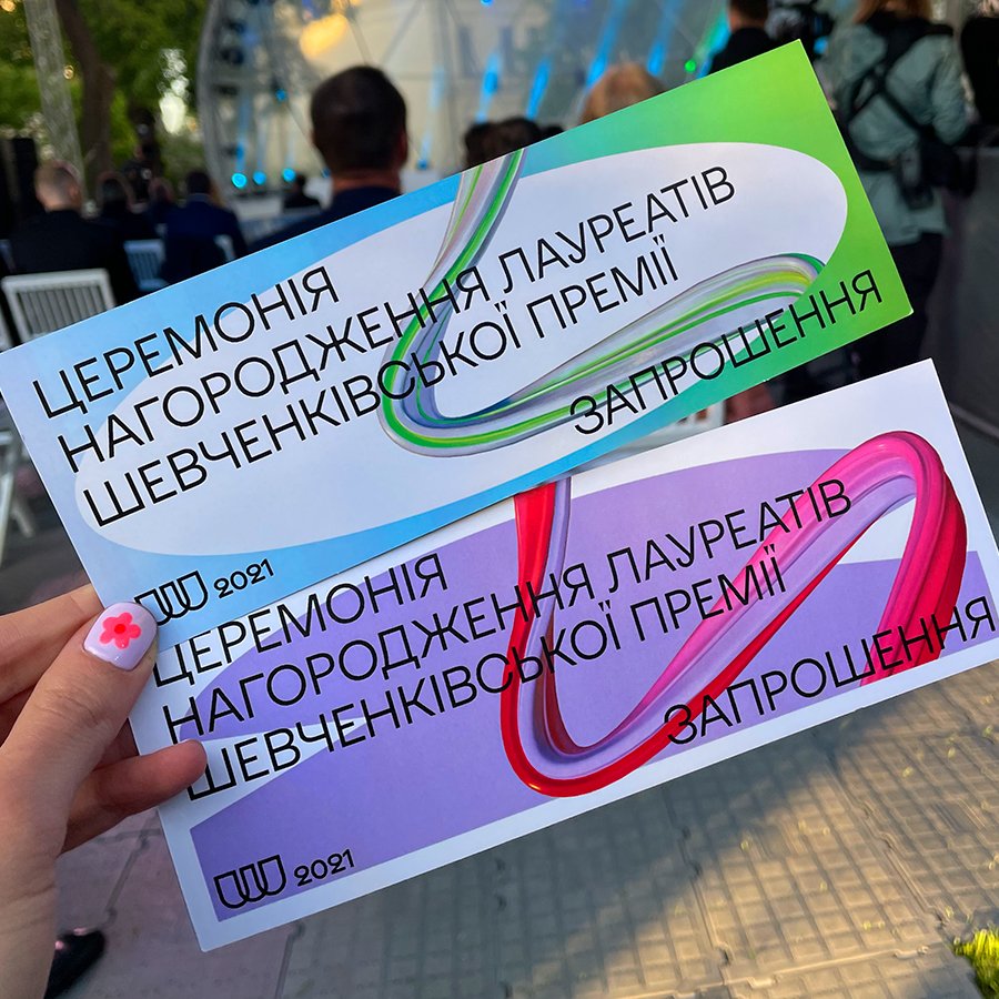
We've created a brand identity based on the strategy that reflects the main brand message and the idea that culture is like a light ray that pierces right through society and inspires generations. The whole style of the brand is a modern look at the Ukrainian Baroque, and also reflects Ukrainian eclecticism.
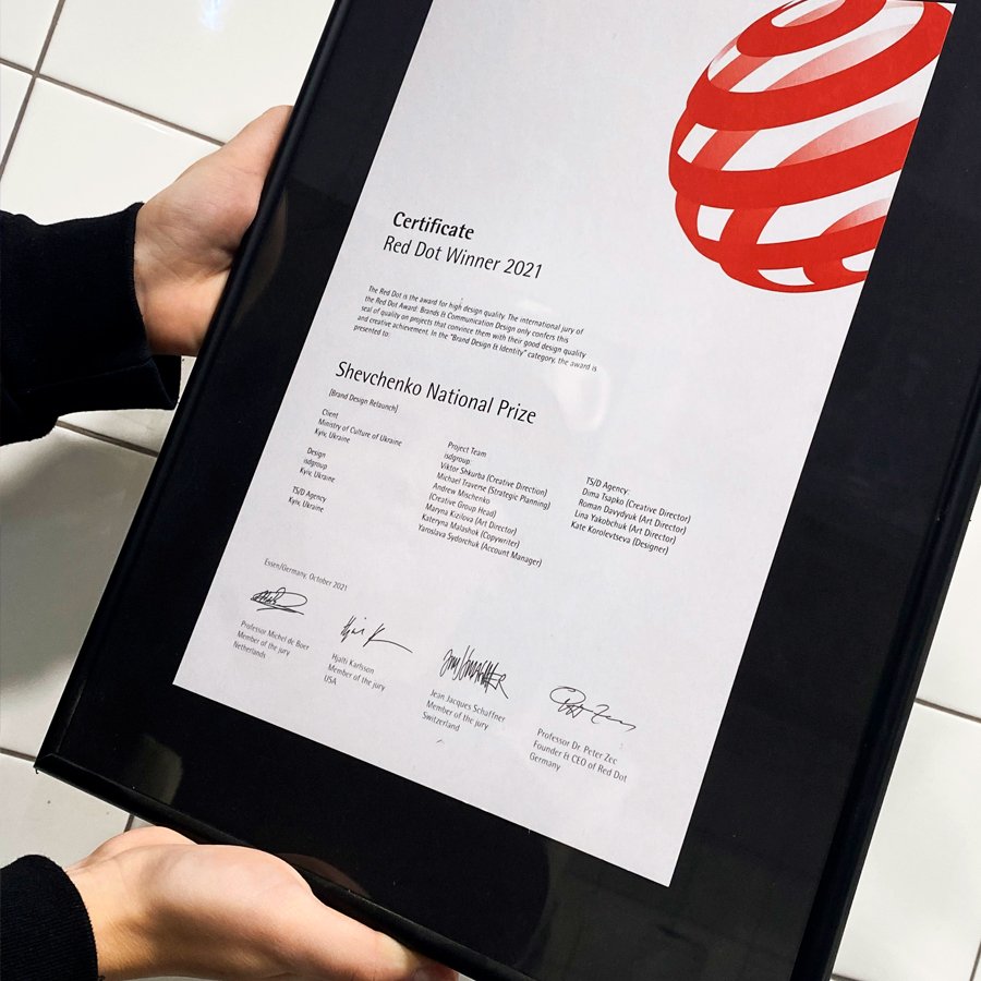
This project has won 2 Red Dot Design Awards in 2021: Cultural Institution Brand and Brand Design Relaunch.
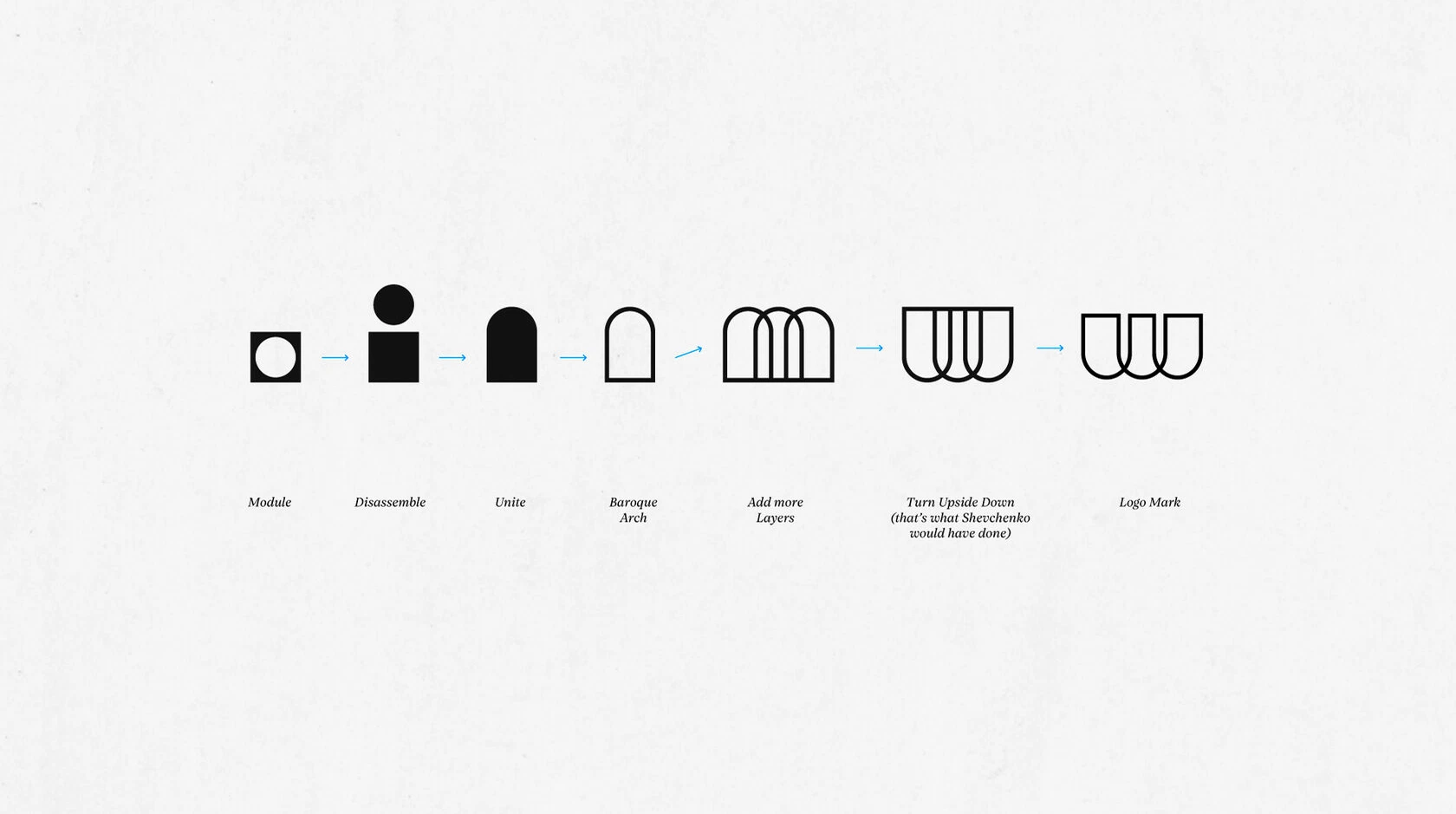
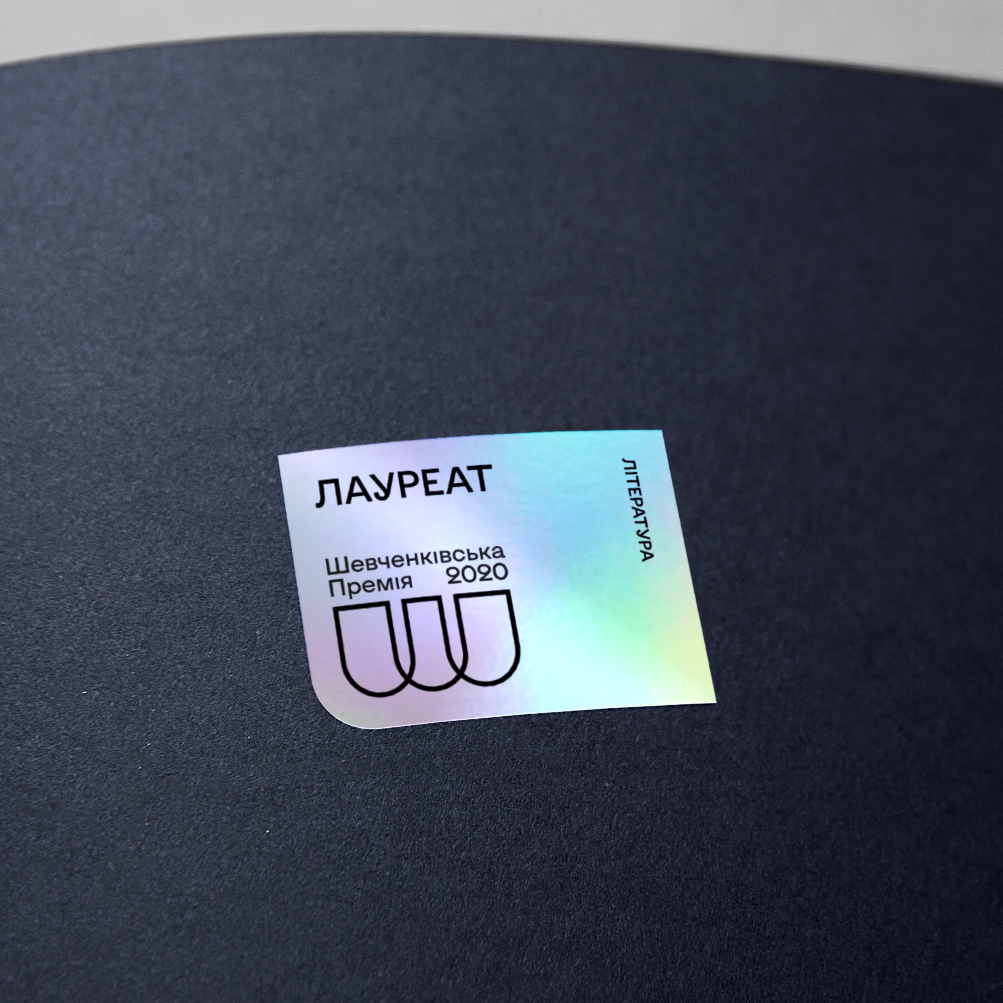
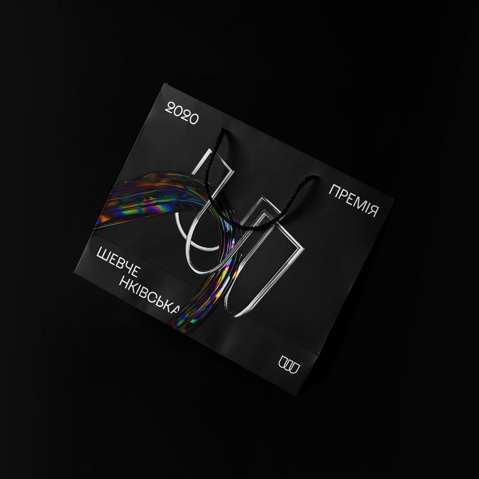
Logo Idea
The idea of the logo comes from the architectural arches, which are part of the Baroque style. Three arches are compound in one continuous shape, and they form together Cyrillic letter 'Ш', for the name of the Prize.
I wanted the logo to look elegant and out of time, unaffected by trends.


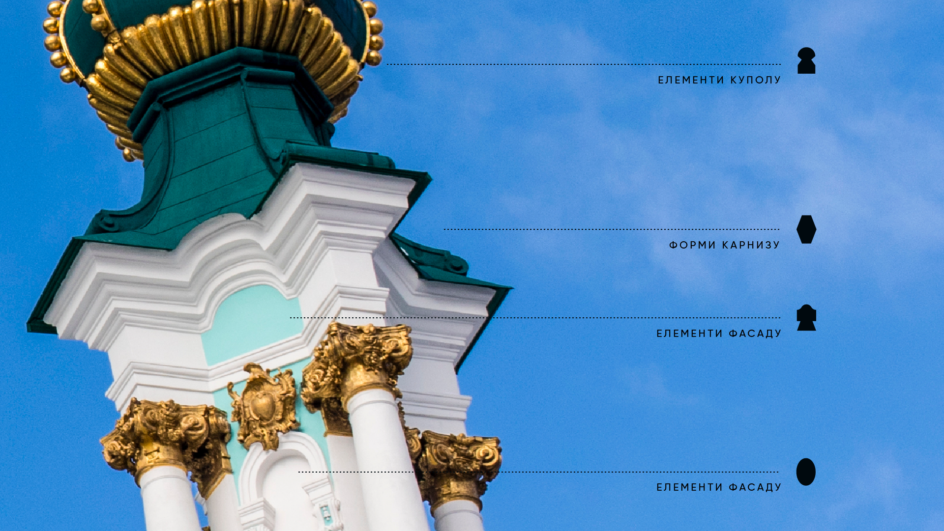
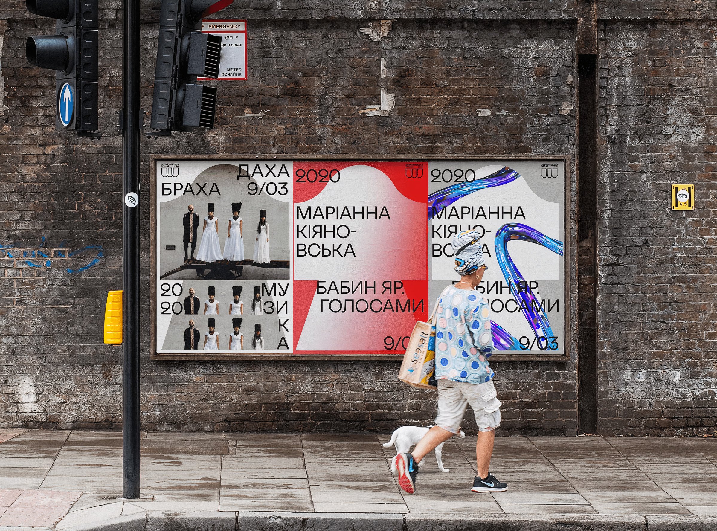
Visual Language
The visual language of brand identity is based on the shapes, which come from the Baroque style, and they are used as modules for typography and photos, so the style has a lot of opportunities to work with.
C R E A T O R S :
Kateryna Korolevtseva
Lina Yakobchuk
Dima Tsapko
Roman Davydyuk
S T R A T E G Y :
isdgroup