Expromt font (in progress) •
Expromt font (in progress) •
R O L E :
Type Design • Graphic Design
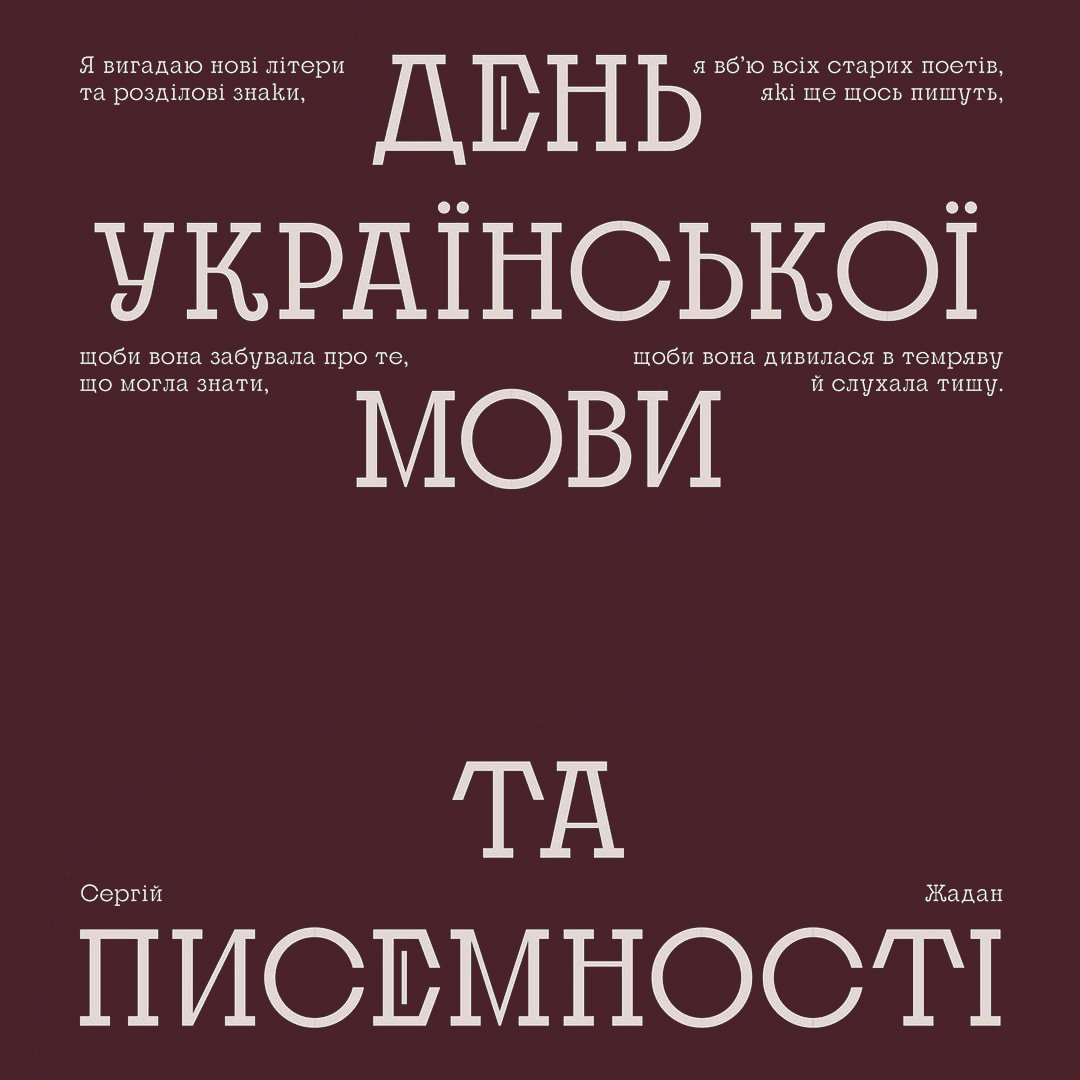
Expomt is a modern slab serif typeface with unusual inner high contrast and different proportions. It was inspired by the Ukrainian type design heritage, especially by the cover of a collection of works for piano created by Ukrainian graphic artist Hryhoriy Berkovych in the early 1930th.
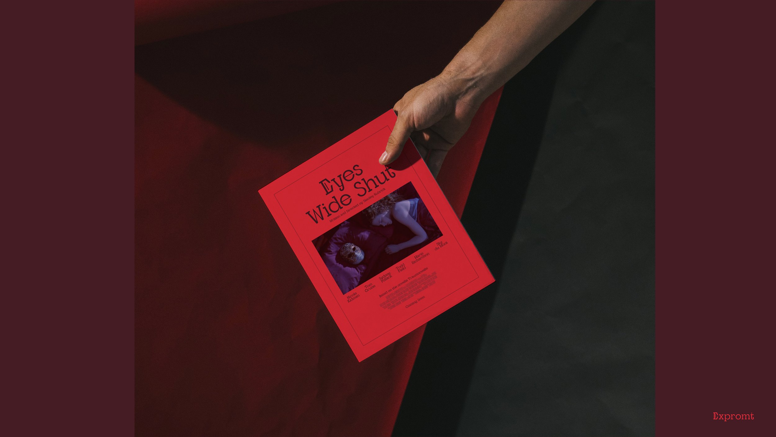
Expromt is like a creative intellectual who likes art, music, and spends a lot of time with books. It would work best in posters, ads, book covers, fancy packaging, and fashion editorials.

Inspiration
(letters character & proportions)


Proportions
The eye-catching combination of normal narrow forms with the wide forms for rounded letters also takes inspiration from geometric styles of the Art Deco movement. Also, I found inspiration in the work of Ukrainian graphic artist Vasyl Krychevskyy (1928).


Naming
I started working on this typeface by creating a low-contrast sans serif font, then came to the low-contrast slab serif, then to the slab serif with classic high contrast. Finally, I came to the modern slab serif typeface with unusual inner high contrast and different proportions. The process looked like an "expromt".


C R E A T O R S :
Kateryna Korolevtseva
S P E C I A L T H A N K S :
Kyrylo Tkachov